Bar Graph (Double) - Maximum at Point (Level 3)
This math topic emphasizes interpreting double bar graphs to answer questions related to comparative analysis. The problems involve examining two sets of data displayed in bar graphs to determine which set has a higher or lower value for a given category such as pizza sales on different days, or rainfall amounts in various cities across different months. These skills are valuable for enhancing data literacy and developing the ability to draw conclusions from visual information presented in graphical formats.
Work on practice problems directly here, or download the printable pdf worksheet to practice offline.
moreGraphing - Bar Graph (Double) - Maximum at Point Worksheet
| Math worksheet on 'Graphing - Bar Graph (Double) - Maximum at Point (Level 3)'. Part of a broader unit on 'Data and Graphs (Mins, Max, Averages) - Practice' Learn online: app.mobius.academy/math/units/data_graphing_sums_and_averages_practice/ |
1

| Which store made more pizza on friday? |
a
| Jane's |
b
| Frank's |
2
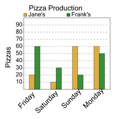
| Which store made more pizza on sunday? |
a
| Frank's |
b
| Jane's |
3

| What month had more rain in new york? |
a
| April |
b
| May |
4

| Which store made more pizza on wednesday? |
a
| Frank's |
b
| Jane's |
5

| What month had more rain in toronto? |
a
| May |
b
| April |
6

| Which store made more pizza on thursday? |
a
| Frank's |
b
| Jane's |
7

| Which store made more pizza on thursday? |
a
| Frank's |
b
| Jane's |