Bar Graph (Single) - Maximum (Level 3)
This math topic focuses on interpreting single bar graphs to identify the maximum value in different data contexts. Students answer questions like which city had the highest amount of rainfall or on what day were the most pizzas made by analyzing the displayed bar charts. This gives practice in data visualization and helps improve skills in interpreting and comparing numerical data graphically. Each question provides multiple-choice answers to reinforce understanding of the graphical data representation.
Work on practice problems directly here, or download the printable pdf worksheet to practice offline.
moreGraphing - Bar Graph (Single) - Maximum Worksheet
| Math worksheet on 'Graphing - Bar Graph (Single) - Maximum (Level 3)'. Part of a broader unit on 'Data and Graphs - Intro' Learn online: app.mobius.academy/math/units/data_graphing_intro/ |
1

| On what day were the most pizzas made? |
a
| Thursday |
b
| Monday |
c
| Wednesday |
2

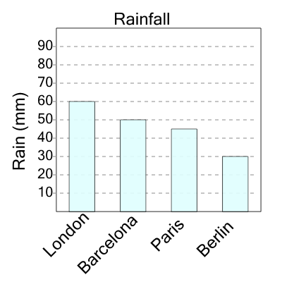
| What city had the largest amount of rain? |
a
| Toronto |
b
| Paris |
c
| Berlin |
d
| London |
3

| On what day were the most pizzas made? |
a
| Saturday |
b
| Sunday |
c
| Friday |
d
| Monday |
4

| What city had the largest amount of rain? |
a
| Barcelona |
b
| London |
c
| Berlin |
5

| On what day were the most pizzas made? |
a
| Thursday |
b
| Tuesday |
c
| Friday |
d
| Wednesday |
6
| What city had the largest amount of rain? |
a
| London |
b
| Barcelona |
c
| Berlin |
d
| Paris |
7

| On what day were the most pizzas made? |
a
| Friday |
b
| Monday |
c
| Sunday |
d
| Saturday |